Cult Crackers
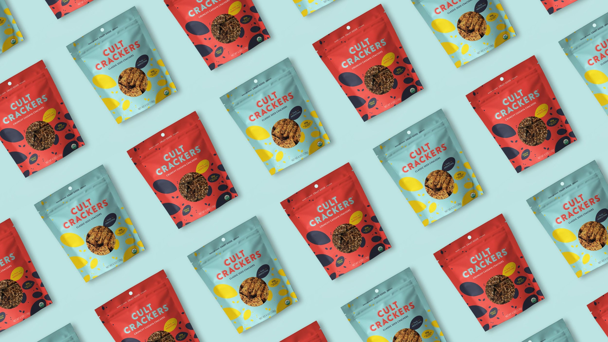
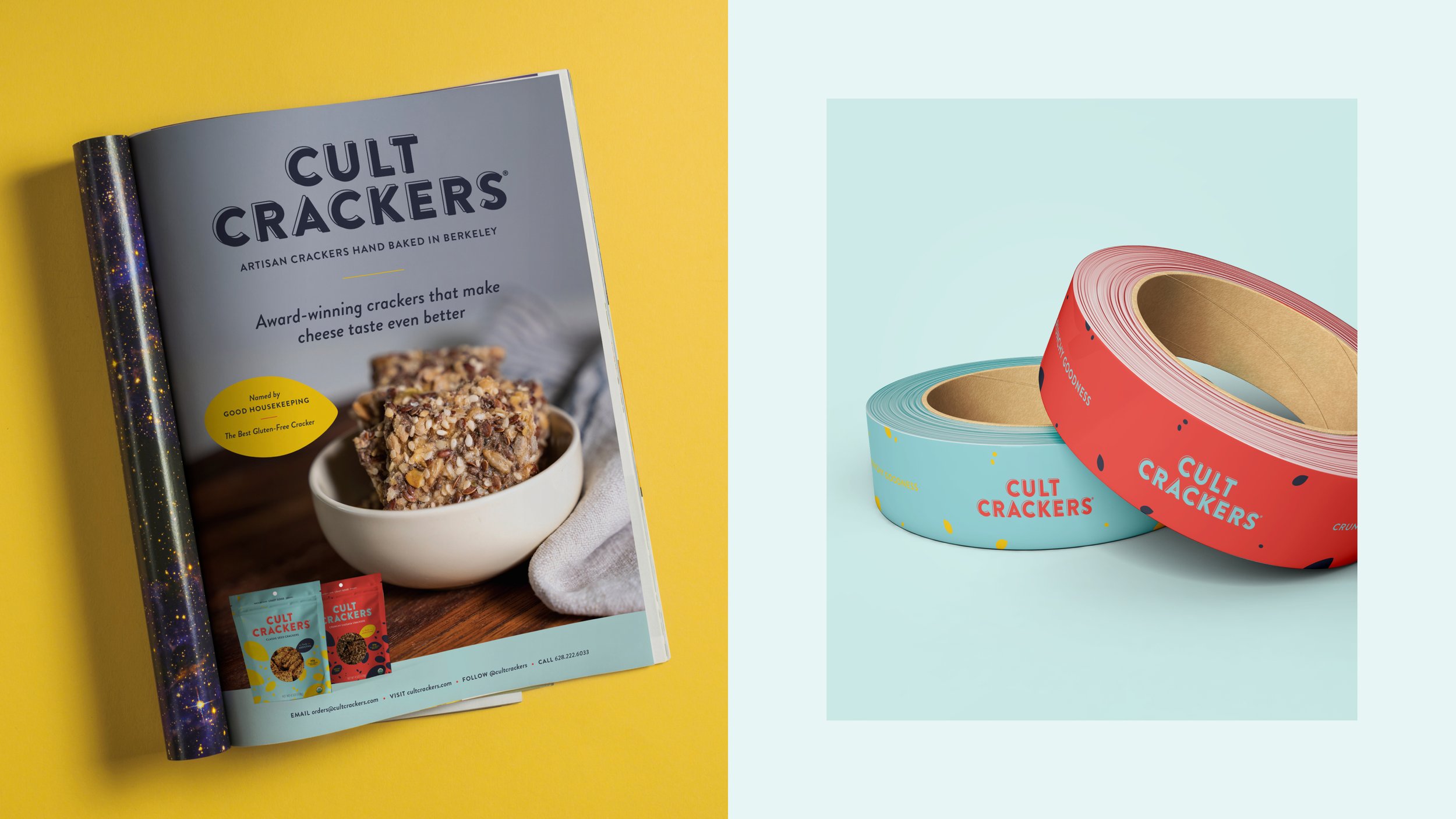
Cult Crackers very rapidly became just that when they first launched — they had a cult following at farmer’s markets and were very quickly popping up all over on supermarket shelves. But they were noticing that in the sea of crackers, their kraft label just wasn’t standing out. They came to me on a mission to come up with a big, bold take on their packaging. I combined a new logo, a color palette rooted in Swedish tradition, and a focus on their star ingredients to create a modern, playful reboot of their brand. Cult Crackers are available all over the nation — give them a try, they’re seriously addicting : )
Branding
Packaging design
Web design
Art direction